Custom "80's" Theme for TouchDRO?

ycroosh

Active User
H-M Supporter - Commercial Member
Joined
Apr 4, 2013
Messages
682
Hi Folks,
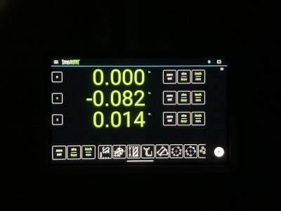
I've been going through TouchDRO's buttons and icons for the last few days (making them more consistent and easier to read). While at it, I set UI to some obnoxious colors so I could see better what was and wasn't done but my wife thinks that I should just offer this as a configurable theme for people with nostalgia for 1980's:

touchdro_80s_mode.png


Here is what it looks with a more sane color palette:

touchdro_normal.png


Let me know what y'all think ;)

Regards
Yuriy
 
Last edited:
I'd use it, can we have different obnoxious colours per axis?
 
PLEASE just leave the color palette on mine the way it came 'out of the box'. :)
No unwanted 'upgrades', thanks!
@ycroosh I have to agree: the standard font/colors/layout work best in my lighting (and I’m used to them). However, if you want to add options (and have nothing better to do?), go for it.
 
Gotta admit, I really like the way the orange grabs attention. Options to configure to personal preference seem like a lovely option to have, though.
 
I find that the default display with grey on black sometimes has insufficient contrast. There's a lot of websites that do this, or worse, and I find them difficult to read. So I'd vote for a color palette with a touch more contrast. Don't know why I have trouble with this, but I suspect it's my slowly growing cataracts. Anyways, that's my two cents. In a way I like the gaudy one. :)
 
i'd say sure if it's a toggle on or off feature. Sometimes brighter works better for me in my shop.
 
My my case, form follows function. I want the display to be visible under all lighting conditions and for that to happen , I want the highest contrast possible. Human vision is the most sensitive to green and with failing eyesight, the lime green does it for me. My personal preference is also the 7 segment font.
 
Back
Top